
Smart Packaging Design: How Dermalog Kids Solved the Toddler Skincare Problem
A packaging designer's analysis of Dermalog kids skincare: exploring how smart design choices create shelf appeal, solve parent problems, and make bath time easier with playful bunny ear packaging.

MASSterclass in Mass Retail
From concept to 1,500+ Walmart stores in 12 months ⚡
Last year I had the incredible opportunity to lead the complete development and launch of Pretty Smart cosmetics: a Gen Z-focused makeup line created in partnership with Walmart. And when I say complete, I mean everything: sourcing materials, creating product structures, packaging design, visual merchandising, e-commerce rollout, email campaigns, and even an AR try-on app.
Working directly with Walmart buyers was a masterclass in retail reality. Every design decision had to balance our creative vision with their strict pricing requirements, compliance standards, and deep understanding of their customer base. It's one thing to design beautiful packaging, it's another to make it beautiful, functional, cost-effective, AND shelf-ready for nationwide rollout (not to mention fassttttt).

The (pink) line between protecting equity and stifling creativity
Last night I went down a rabbit hole trying to find the perfect pink for a client's logo. I came across this viral story from 2016 about the great Vantablack vs Pinkest Pink feud and my first reaction was to laugh at the ridiculousness.
For anyone who missed it: Anish Kapoor locked down exclusive rights to Vantablack (the darkest black ever made). In response, Stuart Semple created “The Pinkest Pink” and made it available to everyone in the world… except Kapoor.
At surface level, it’s a petty art-world squabble. But it’s also a sharp commentary on gatekeeping creativity. In branding and design, we protect assets all the time - colors, fonts, icons - and there are good reasons for that. But when ownership crosses into exclusivity, it raises the question: at what point does protecting equity turn into limiting innovation?

When design meets ice cream artistry ✨
There's something magical about creating a brand identity that extends beyond packaging into a full sensory experience. My work with Posie, an artisan ice cream shop in Larkspur, CA, was exactly that: a complete visual ecosystem from logo to retail environment.
Unlike my usual CPG packaging projects, this required thinking three-dimensionally about how customers would move through and interact with the space. How do you communicate "locally-sourced, weekly-rotating flavors" through interior design? How does typography on a storefront window translate to the experience of ordering gluten-free house-made cones?

When Someone Else’s Success Feels Like a Win
Opened up Dieline this morning and spotted FABRIC, and it made me smile.
I don’t know the founders personally, but I’ve been following this brand since the early concept stage. Watching it grow from an idea into packaging featured on one of the most respected design publications feels like a full-circle moment.
That’s one of the best parts of working in this industry: you don’t have to know someone personally to root for their success.

The Rebrand That Didn’t Break the Internet: Colgate-Palmolive’s New Look
Turns out not all logo launches need to break the internet. Cracker Barrel’s rebrand got the pitchforks. Colgate-Palmolive’s snuck under the radar. It's less controversial for sure, but definitely smarter.
Loving:
• The new smiling pictorial mark. Such a simple, human detail, and perfectly aligned with their “Make More Smiles” tagline.
• The shift from ALL CAPS to Title Case. It feels friendlier, less corporate, and more approachable.

When Side Projects Get Hot: Designing My Own Hot Sauce Line
Fall farmer’s market season is gearing up in Jacksonville!
This time last year, I was deep in one of my favorite personal projects: building the brand identity for September Harvest 9H Hot Sauce, my family’s artisan hot sauce line. Here are a few of the design directions we explored during our focus group testing.
As a creative director with 15+ years in CPG packaging, I approached it like any client project: bold storytelling, clear strategy, and packaging built to stand out on a crowded shelf (or in this case, in a crowded market).

Olyra: When packaging redesign is done right 👏
I post a lot of design critiques here, but it's nice to see one that's beautifully executed. Spotted the new Olyra packaging at Whole Foods last night, and WOW this redesign nails it.
What works:
- Modern logo that ditches the old Papyrus vibes for something bold and confident
- Smart color coding by flavor (orange here, but each variant gets its own color for easy shelf shopping)
- Clear USPs (high protein, low sugar, high fiber) that you can actually read

The Dual-Layer Brand Approach: Designing Skincare for Two Different Worlds
Ever notice how most skincare aisles look exactly the same?
White bottles. Clean sans-serif fonts. Maybe some bamboo if they're feeling adventurous. It's like every brand got the same "trustworthy skincare" memo. Snore...
So when I developed theBalm's skincare line, I had a choice: blend into the boring sea of clinical minimalism or find a way to honor what made theBalm unique while earning skincare credibility.
The challenge: How do you marry clean, clinical aesthetics with quirky retro pinup personality?

When Eye-Catching Design Misses the Message
I came across Street Legal's new can design, and the playful graphics IMMEDIATELY caught my attention. The bold colors and fun aesthetic create great shelf disruption - exactly what you want in the crowded beer space.
But here's the thing: I didn't even realize it was non-alcoholic beer until I looked up their old packaging for comparison.
Their original design clearly communicated "dealcoholized pilsner" - direct and unmistakable. The new design buries this crucial product differentiator in favor of visual appeal.
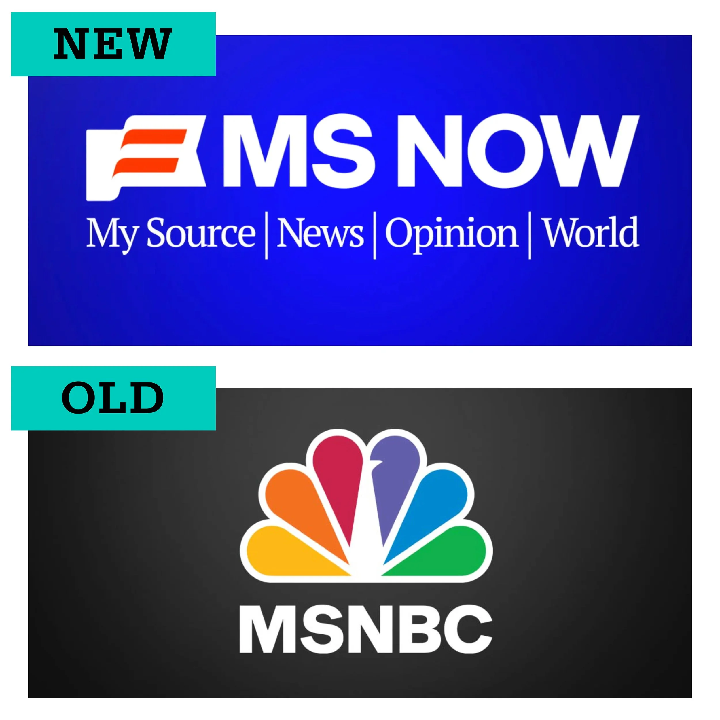
From Peacock Pride to PowerPoint Blue: MSNBC’s Identity Crisis
Just spotted the new MSNBC → MS NOW logo and eek… it’s giving PowerPoint template.
They stripped away decades of equity - no peacock colors, no distinctiveness - and landed on a clipart flag, paired with a generic font, slapped on top an incredibly boring blue gradient.
Blue is safe. It’s digital. It’s corporate. But it isn’t inviting. It isn’t human. And paired with a serif that already feels dated, it doesn’t exactly scream relevance for a younger audience.
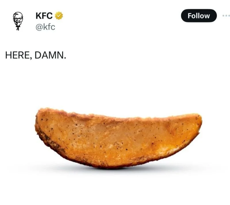
KFC plays close to the fryer with the return of their wedges
KFC announced the return of their potato wedges with this slightly hostile post.
It’s giving Wendy’s energy… and honestly, it made me laugh. And commenters love it.
Sometimes the fastest way to win over your customers is to skip the overproduced campaign and just give the people what they want.
Not sure I personally would be so risky with my marketing copy… but maybe I’m just a chicken 🍗
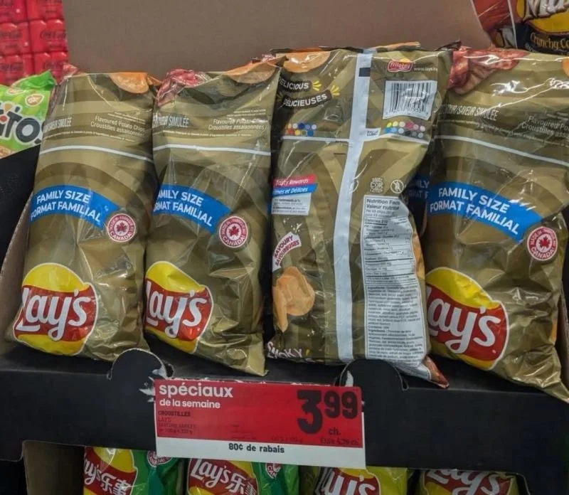
Keep your friends close, and your print vendor even closer
Keep your friends close, and your print vendor even closer.
Doesn’t matter how many dinners you have with the C-suite or how much time you spend perfecting the package design strategy… if someone’s not watching the details throughout the pipeline, all the way to the shelf, you can lose the game in the last minute.
These Lay’s chip bags are a perfect example. Somewhere between the press operator, the QA team, and the people stocking shelves… nobody flagged it. And all that high-level effort gets undercut by one very, very sad print job.

Cute Packaging Isn’t Enough: The Rise and Fall of Youthforia
Youthforia quietly announced they are going out of business earlier this week and I'm disappointed but not surprised.
When they first hit the scene post-covid, every designer in the beauty industry had their eye on them. The packaging was adorable, the colors popped, and their lifestyle photography was pure mood board gold. It was the kind of visual storytelling all brands dream of: fresh, fun, and instantly recognizable.
But great branding can only carry you so far.
Their foundation launch last year came with just 15 shades 🤯. (Yes, in 2024.) The lack of true inclusivity was outrageous. The backlash was swift, retailers pulled out, and even after adding shades, the trust damage was done.

Your logo is not as unique as you think it is!
Nike's swoosh is basically gold standard for logo design - but it's not the only swoosh on the market.
Here's 16 swooshes from 16 other brand logos. Can you tell me which swoosh is from which company's logo? (No reverse image search, no cheating... And hint: None of them are Nike!)
Even for a brand nerd such as myself, this is basically an impossible test. Because these logos are simply not distinct enough. When you're creating a logo for your brand, ALWAYS bring in some of what makes you different (and weird!) because that's what will make your brand stand out.

Confessions of a Sustainable Packaging Hoarder
Cleaning out my closet this weekend and found a box of old EcoFabulous serum prototypes, which made me laugh, because of course the person who led creative for a sustainability brand is also hoarding packaging samples.
From 2019 to 2022, I helped build EcoFabulous from the ground up. That meant everything from early research into sustainable materials to product design, creative direction, brand identity, and launch. We developed over 50 SKUs, partnered with vendors around the world to get the packaging right (and actually sustainable), and I had the privilege of recruiting and mentoring an incredibly talented creative team… you know who you are 😘 !
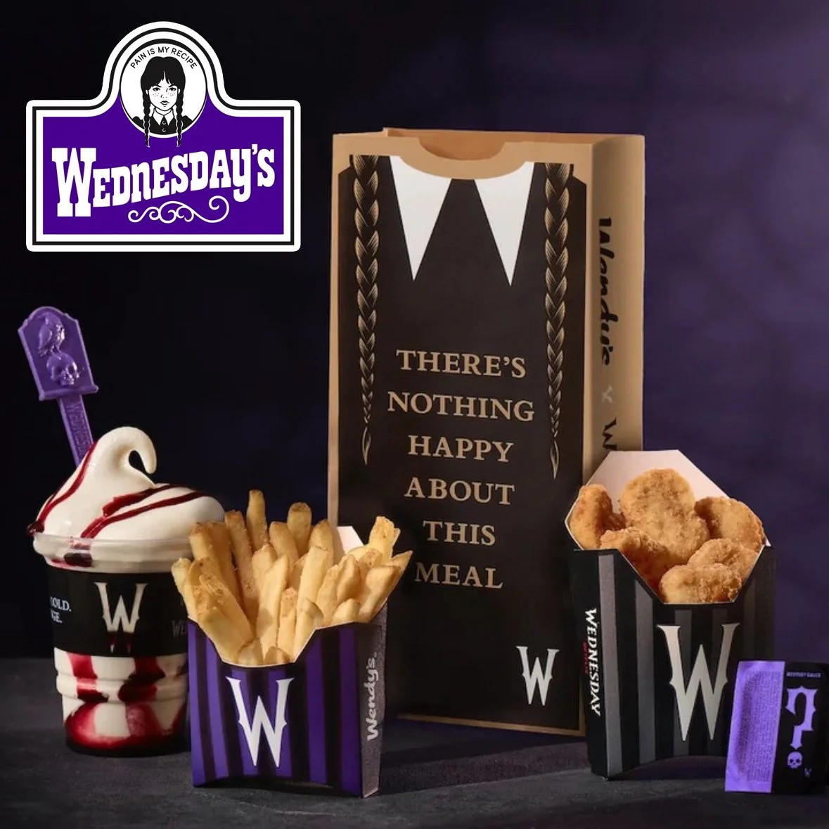
Wendy x Wednesday Is the Collab We Needed
I am DEAD ☠️
Wendy’s is teaming up with Wednesday for a limited time meal collab dropping August 4, just in time for the new Netflix season premiere.
I saw the packaging and legit got giddy. The braided pigtail crossover? The moody meal bag that says “There’s nothing happy about this meal”? It’s hilarious and kinda genius.
The meal itself is loaded with puns (“Rest in 10-piece Nuggets”) there are spicy mystery sauces, and they’re even lauching a new mobile game. It’s all the weird, rebellious energy you’d expect from Wendy’s at this point. Honestly, they nailed it. It feels super fun, super clickable, and totally on-brand for both characters.

Legends of the Fall... of Good Packaging
So, I know Brad Pitt made soap in Fight Club, but does that really give him R&D experience in the skincare industry? My husband came across Brad Pitt’s new Beau Domaine men’s skincare products while traveling in Europe last week and took a ton of pics to show me the packaging. I’ve definitely got some thoughts…
First reaction? The overall vibe feels… confused. The wood-and-metal cap is supposed to feel premium, but the proportions are awkward and the finish is kind of clunky. I get that it’s meant to echo wine barrels, but I’m not sure who this is for. It feels like it’s trying really hard to look luxurious, but just ends up looking… heavy? And honestly, kind of boring. Also, the gold detailing on the jar and the silkscreen text don’t match. Not a huge deal, but if you’re charging $285 for a serum, that kind of stuff matters.
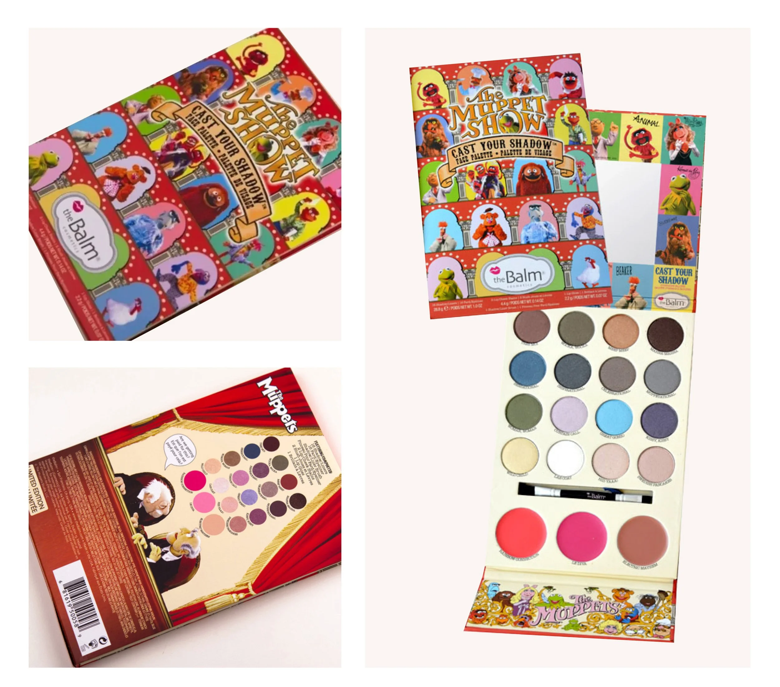
No Strings Attached: Muppet Magic in a Makeup Palette
Throwback to the time I was asked to design for one of my childhood favorites!
Collaborating on this limited-edition Disney x theBalm eyeshadow palette for The Muppet Movie was a dream come true.
I worked directly with the Disney team to bring their vision to life. And if you’ve ever worked with Disney, you know they take character integrity seriously. Every Muppet has an established personality, and every detail (from shade names to layout) had to honor that. If it wasn’t authentically Kermit, it wasn’t going in the palette.

Data, Not Vibes: Why Range Rover’s Logo Fell Flat
Has Jaguar out-Jaguared itself? Range Rover’s new logo dropped and... YIKES. Someone said it “looks like a belt buckle turned on its side.” That might actually be generous.
The new double-R emblem was revealed as part of Jaguar Land Rover’s push to elevate Range Rover as its own standalone luxury brand. It’s meant for merch and digital use, not the car itself... which is honestly a relief, because it’s giving crypto exchange, not $100K SUV.